Build a static ggplot showing the per-peptide shift in prevalence
(\(\Delta = group2 - group1\)) as a function of pooled prevalence
(\((group1 + group2)/2\)). The input should be a tibble/data frame produced
by ph_compute_prevalence() or equivalent with columns
group1, group2, prop1, and prop2.
Usage
deltaplot(
  prev_tbl,
  group_pair_values = NULL,
  group_labels = NULL,
  point_jitter_width = 0.005,
  point_jitter_height = 0.005,
  point_alpha = 0.25,
  point_size = 0.6,
  add_smooth = TRUE,
  smooth_k = 5,
  arrow_color = "red",
  arrow_head_length_mm = 4,
  arrow_x_frac = 0.97,
  plot_title = NULL,
  plot_subtitle = NULL,
  x_label = NULL,
  y_label = NULL
)
Arguments
- prev_tbl
Data frame with columns
group1,group2,prop1,prop2. Optionalfeatureis used for row identity only.- group_pair_values
Optional length-2 character vector
c(group1, group2). Use this whenprev_tblcontains multiple group pairs.- group_labels
Optional length-2 character vector of display labels
c(label_group1, label_group2). Defaults togroup1/group2.- point_jitter_width, point_jitter_height
Jitter amounts for the points. Defaults 0.005.
- point_alpha
Point transparency. Default 0.25.
- point_size
Point size. Default 0.6.
- add_smooth
Add a GAM smooth curve (
mgcv). DefaultTRUE.- smooth_k
Basis dimension
kfor the smooth. Default 5.- arrow_color
Color for the directional arrows and labels. Default
"red".- arrow_head_length_mm
Arrow head length in mm. Default 4.
- arrow_x_frac
Arrow X position as a fraction of the max pooled prevalence. Default 0.97 (near the right edge).
- plot_title, plot_subtitle
Optional plot labels for the title/subtitle.
- x_label, y_label
Optional axis labels. Defaults are generated from the group labels.
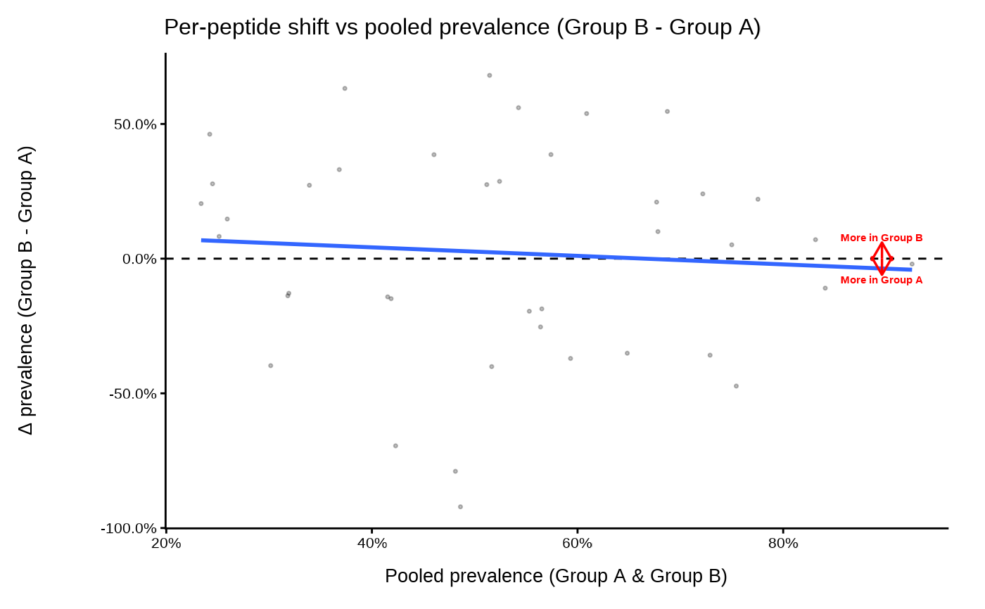
Details
The plot places each feature (peptide) as a point at:
x-axis: pooled prevalence
(prop1 + prop2)/2y-axis: prevalence shift
(prop2 - prop1)
Points are optionally jittered for visibility. A dashed horizontal line marks
\(\Delta = 0\). Optional arrows and labels indicate the direction of
increased prevalence for group1 vs group2. If
add_smooth = TRUE, a GAM smooth is overlaid to summarize the trend
across pooled prevalence.
Examples
set.seed(1)
n <- 40
prev_tbl <- data.frame(
  feature = paste0("pep", seq_len(n)),
  group1  = "A",
  group2  = "B",
  prop1   = runif(n),
  prop2   = runif(n)
)

p <- deltaplot(
  prev_tbl,
  group_pair_values = c("A", "B"),
  group_labels      = c("Group A", "Group B")
)
#> [09:29:18] INFO  Preparing delta prevalence plot.
print(p)